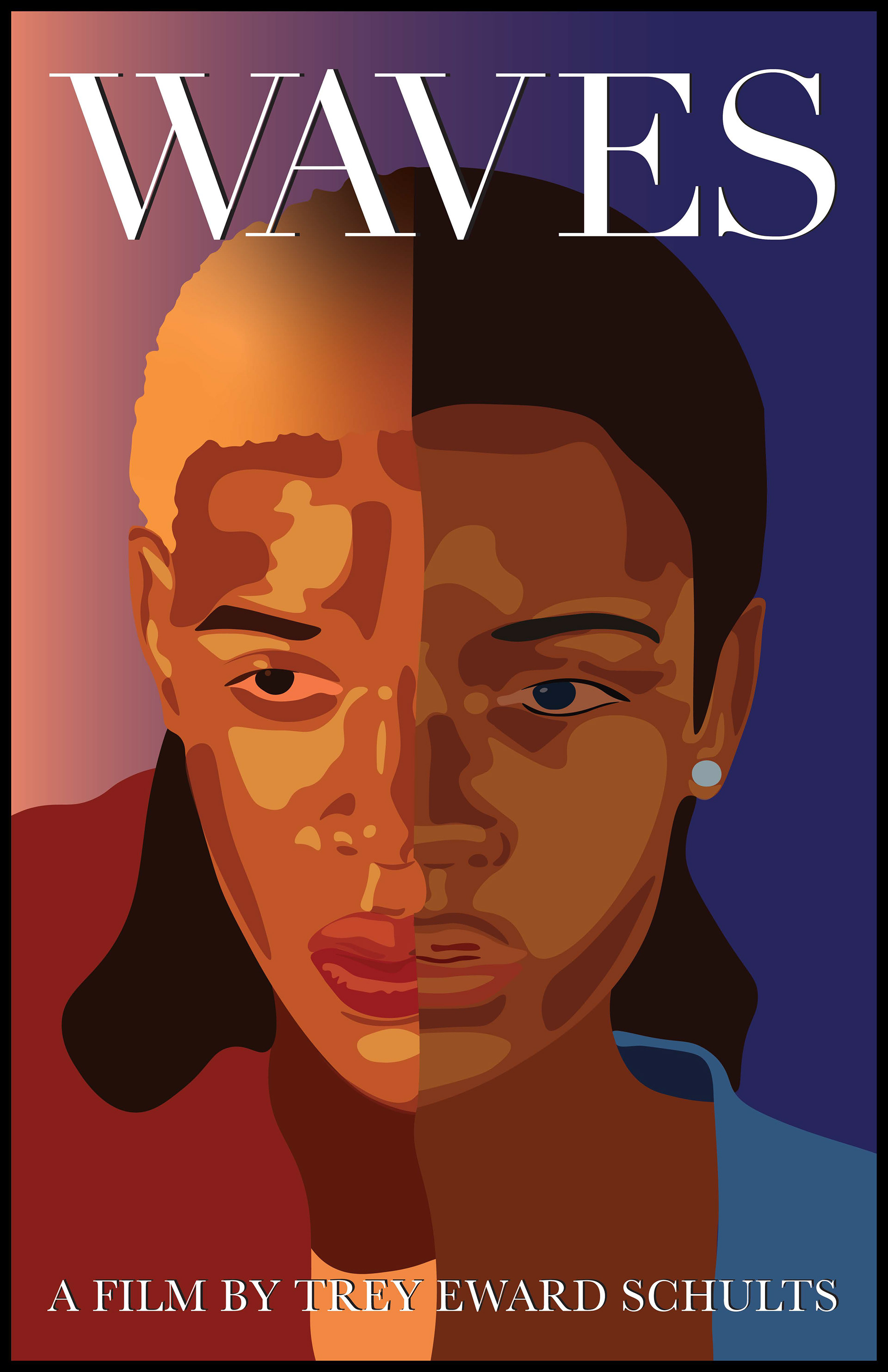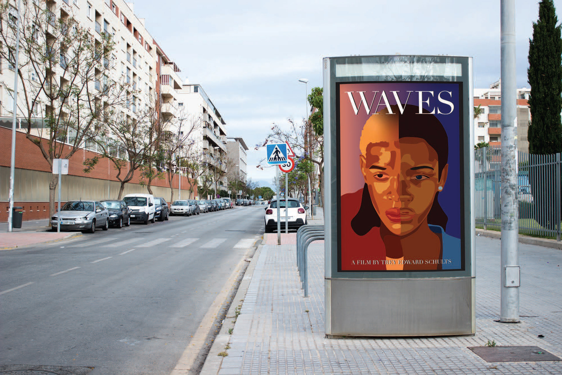
To create the movie poster, I rewatched the film to fully understand the visuals and the story being told. I focused on the two main characters and the shifting perspectives between them. To convey this, I decided to feature only half of each character’s face, complementing one another. The colours I chose reflect the characters’ emotions throughout the film bright red for the boy, representing his personality and anger, and a deep, calm blue for the girl, symbolizing her sadness. I wanted it to feel like light was shining on one character while the other remained in shadow.
For the typography, I kept it simple to ensure the faces remained the focal point. Overall, the poster stays true to the film’s visuals while adding depth to its story.