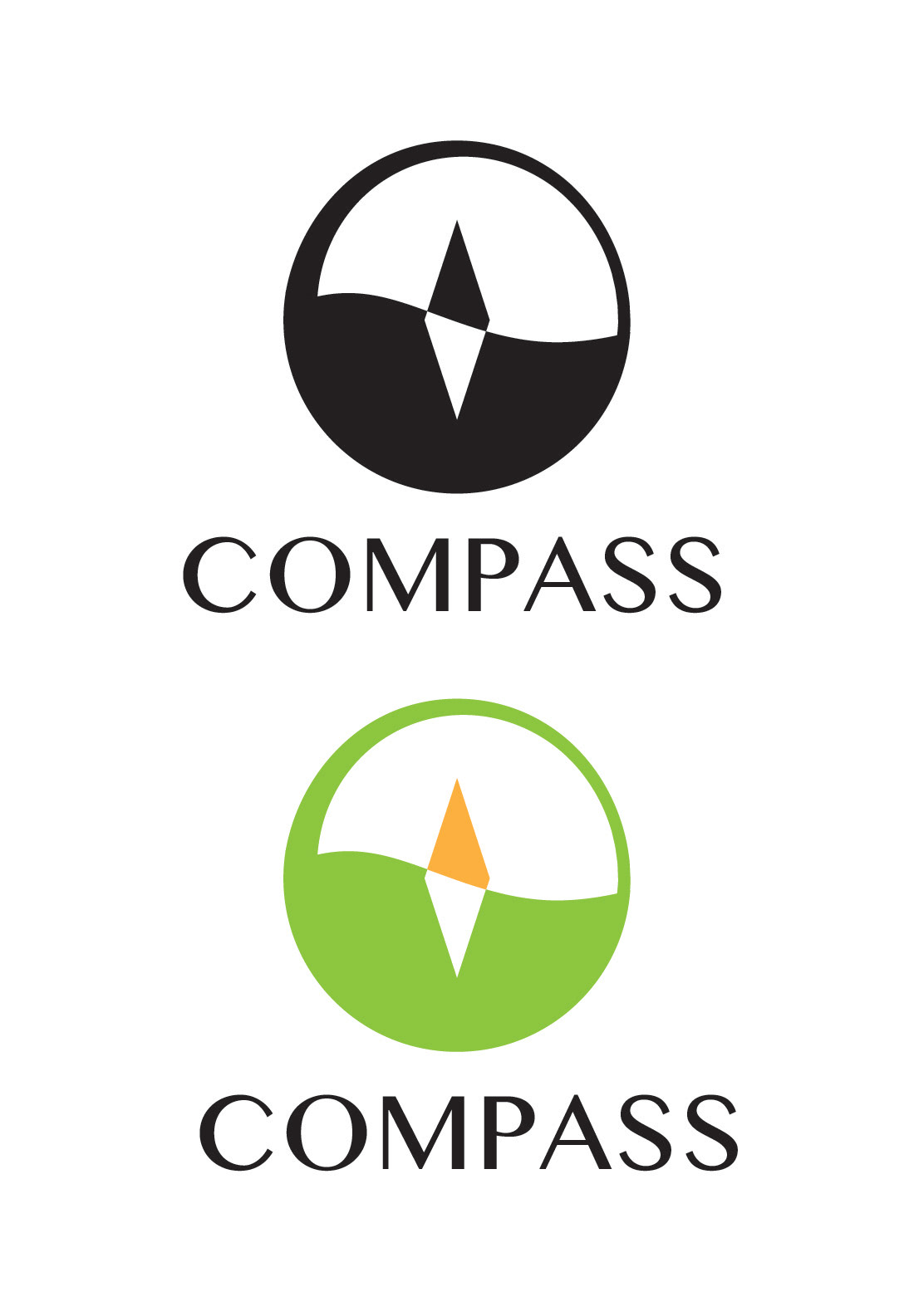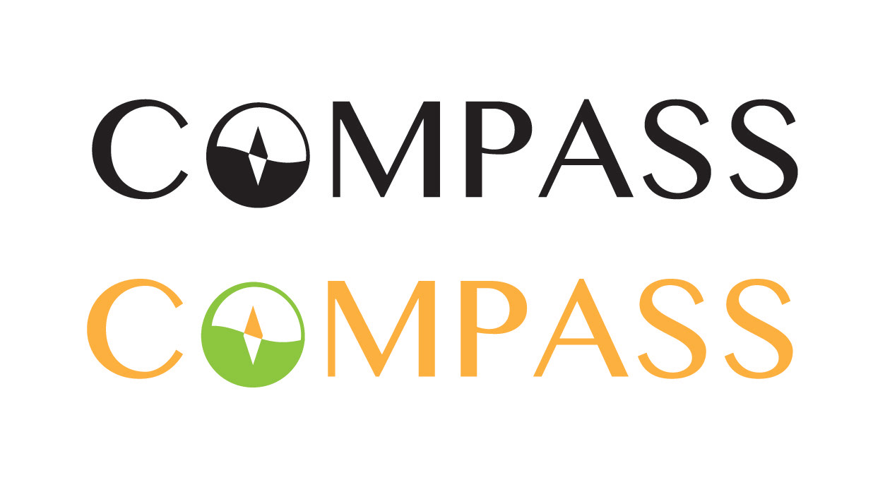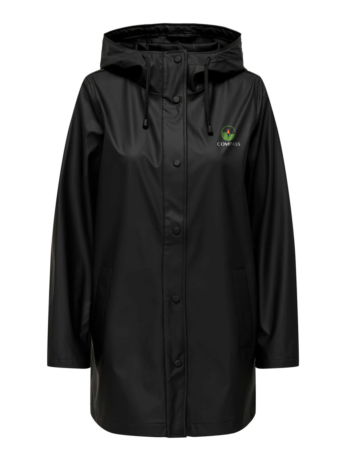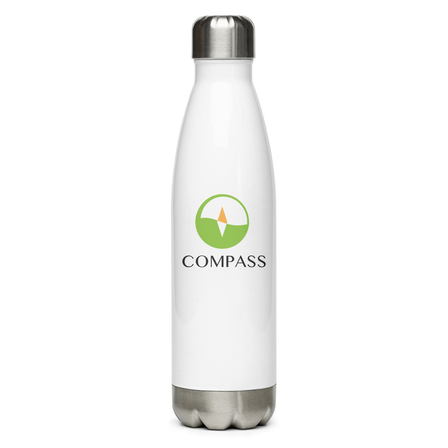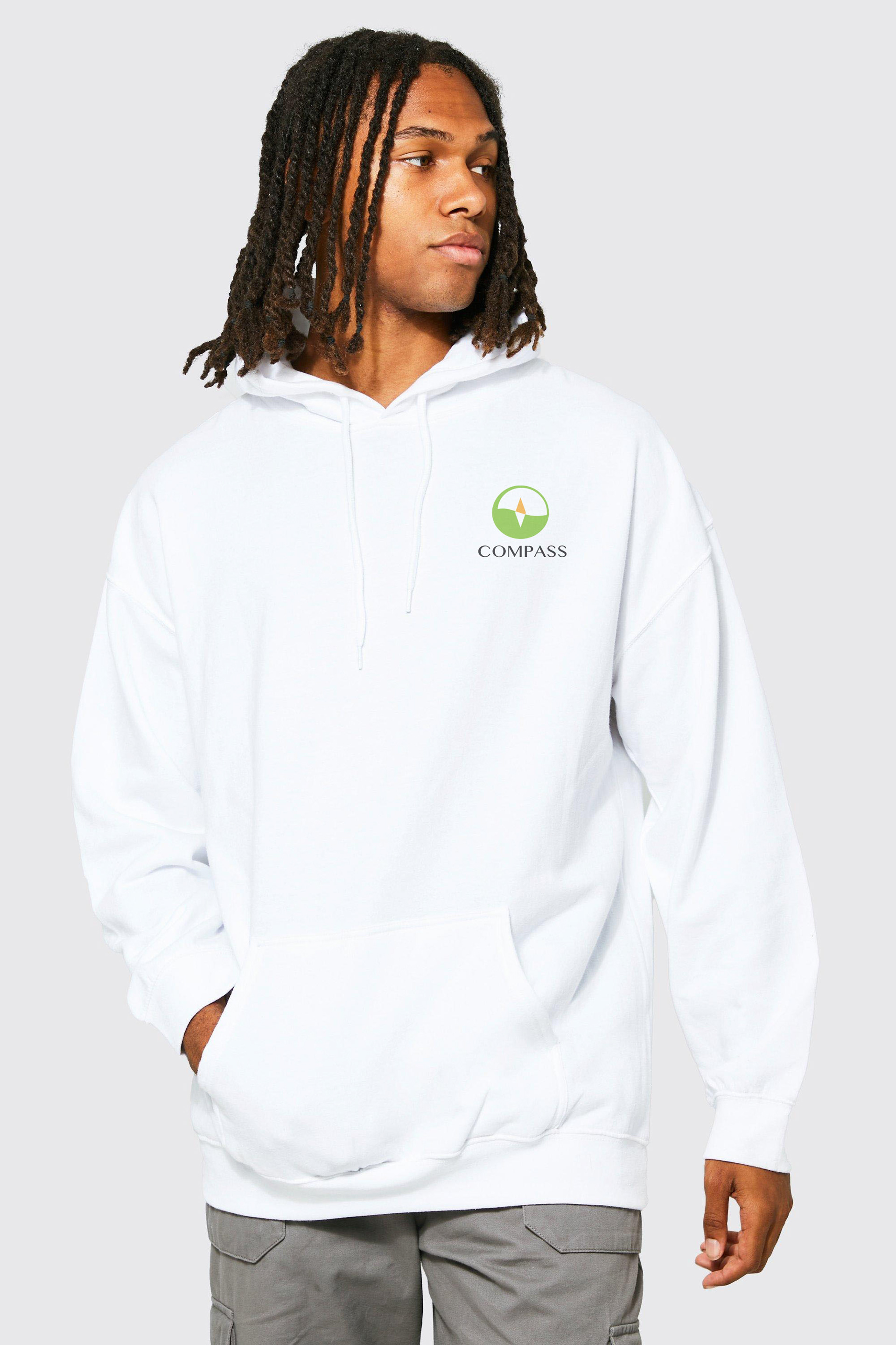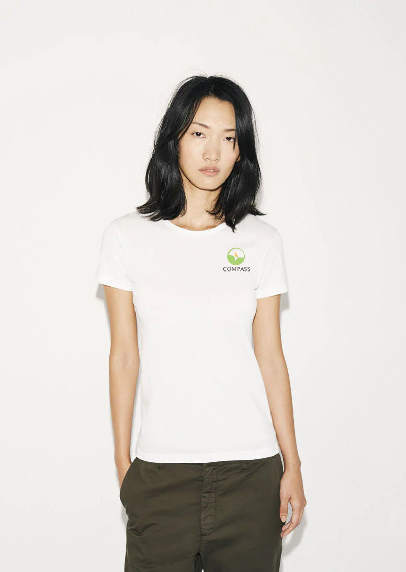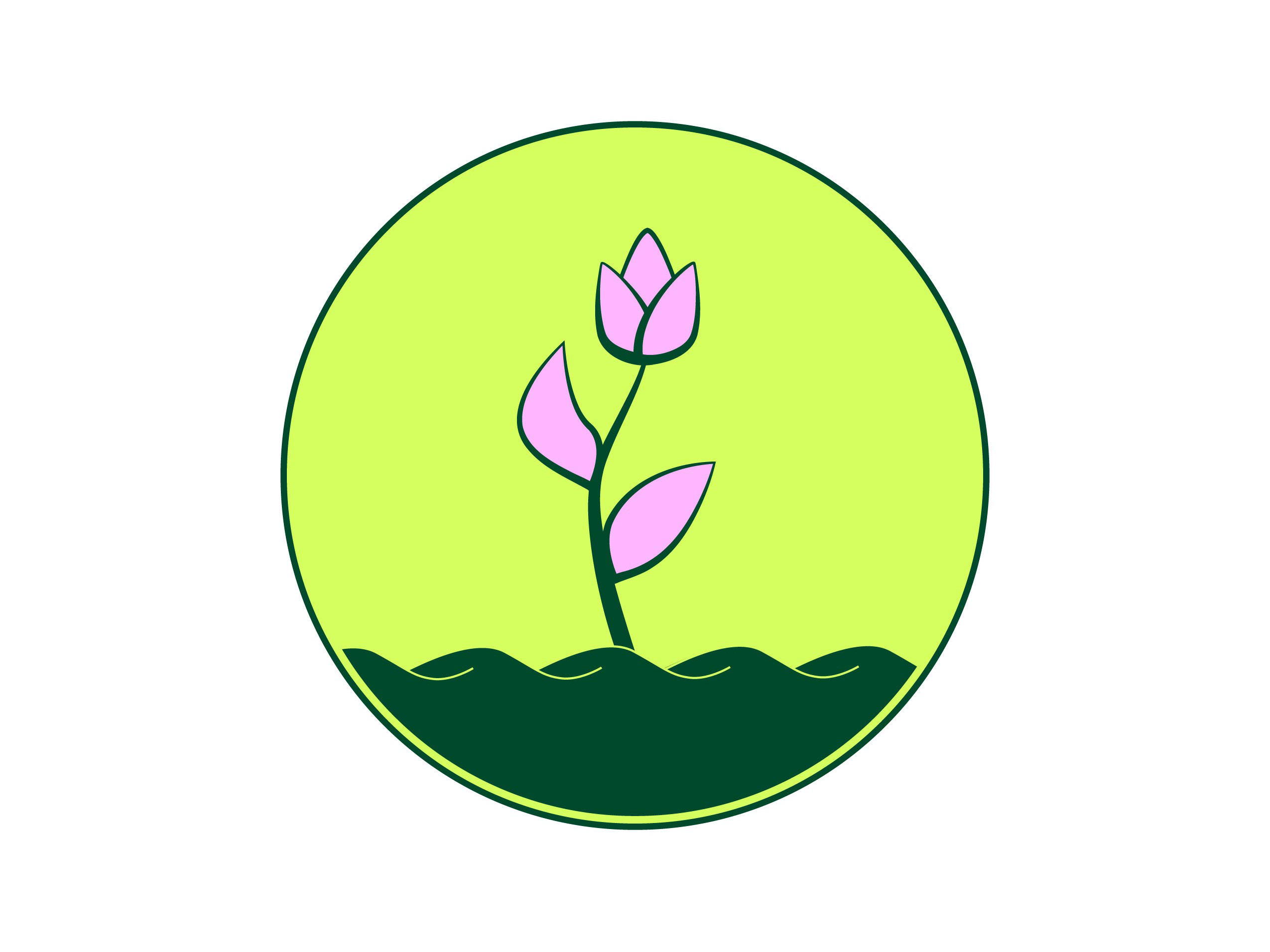
To develop a fresh corporate identity for the project, I began with the logo. The design features a compass, which ties in perfectly with the brand name and reflects the outdoor nature of the company. I added a wavy middle line to represent water, while the yellow needle symbolizes the sun. I created several versions of the logo to ensure versatility and ease of recognition. For the deliverables, I kept green as the brand’s primary colour, with the compass logo used as a watermark. Overall, the logo design is simple, recognizable, and effectively communicates the essence of the brand.