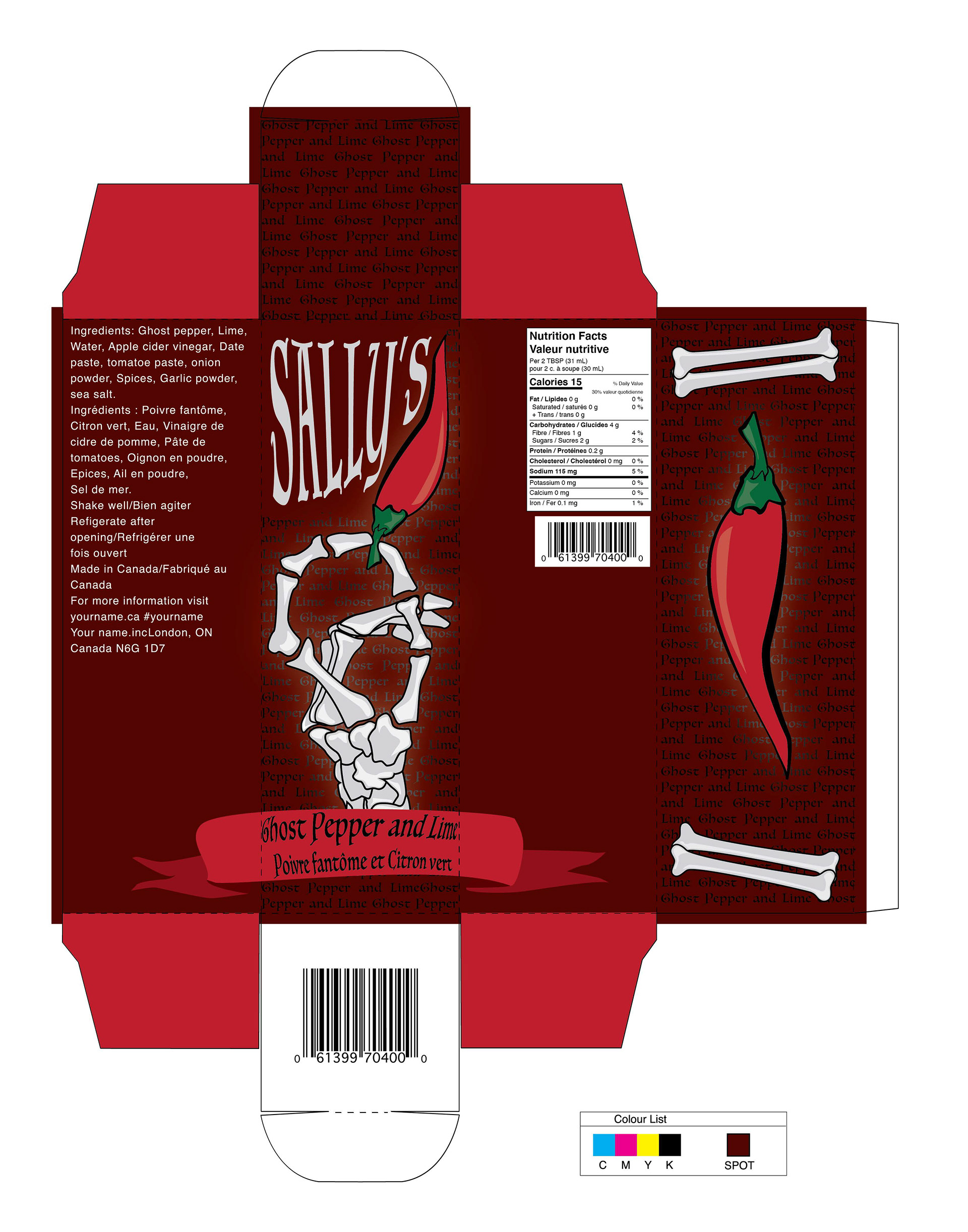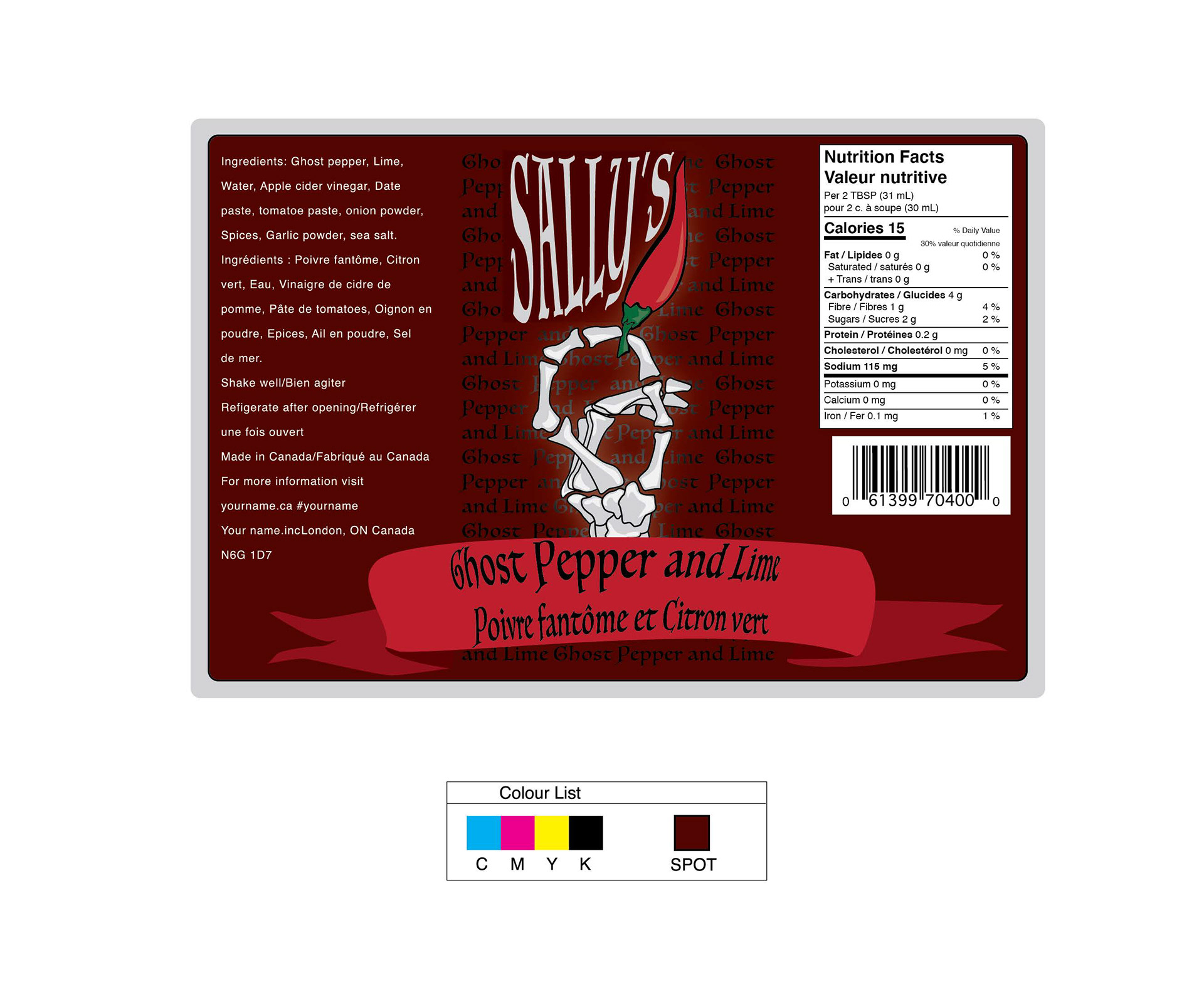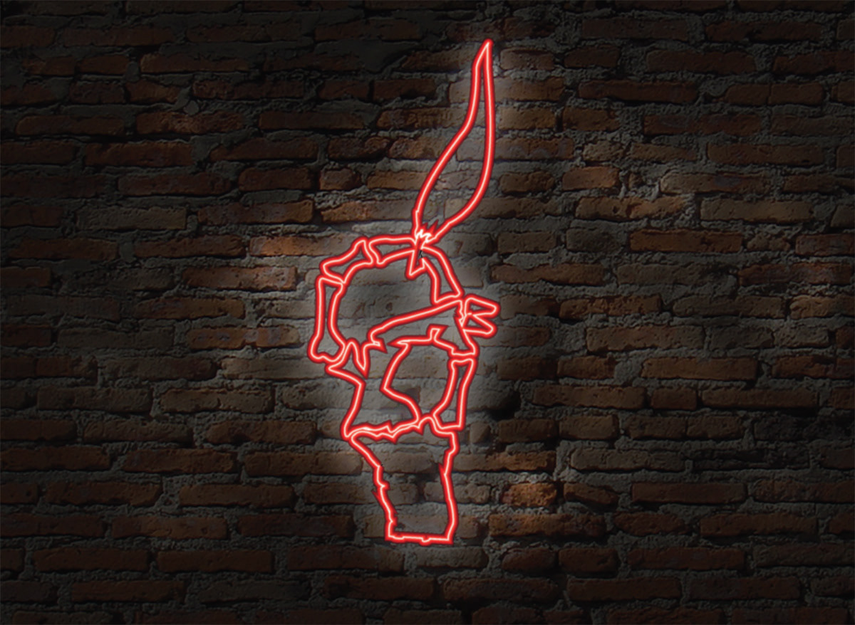
I started by sketching a lot and knew I wanted to incorporate elements of the packaging, particularly the colour red, into the design. To emphasize the heat of the sauce, I illustrated a skeleton hand, symbolizing how dangerously hot the sauce is—almost like it could burn you if you hold it. The red colour represents the intense heat, and I chose a darker shade since, typically, the darker the pepper, the hotter it is. Overall, the design is fun and effectively conveys the fiery intensity of the hot sauce.