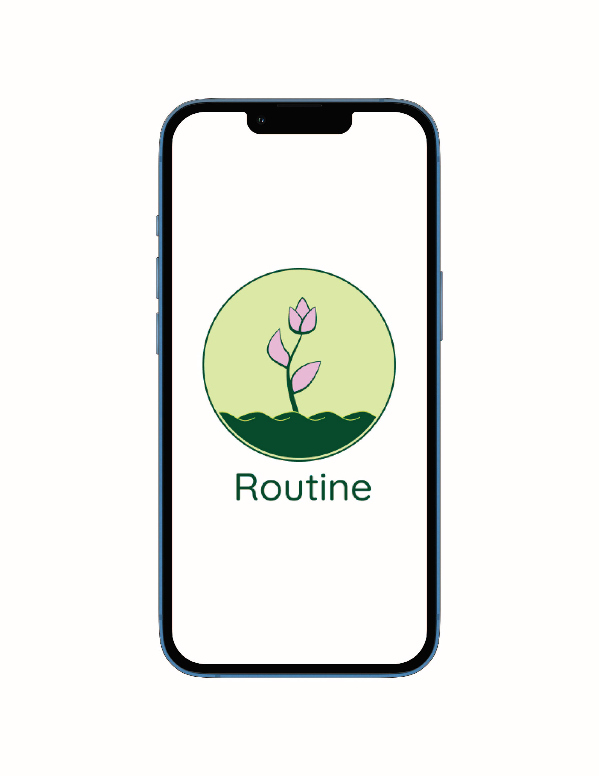
The app’s focus was on helping users manage anxiety and stress in daily life, so I wanted the design of Routine to feel light and colourful. I chose soft pinks, greens, and calming blues to create a soothing atmosphere. The navigation is simple, offering a variety of options to help users cope with their stress. I used minimalist icons to reflect the overall feel and purpose of each feature.
For the logo, I designed a flower on the verge of blooming, symbolizing the user’s journey with the app. I kept the colour palette consistent with the pinks and greens to tie everything together. The font is clean and minimal, aligning with the app’s theme. Overall, the design is clear and cohesive, providing a joyful and calming experience for the user.