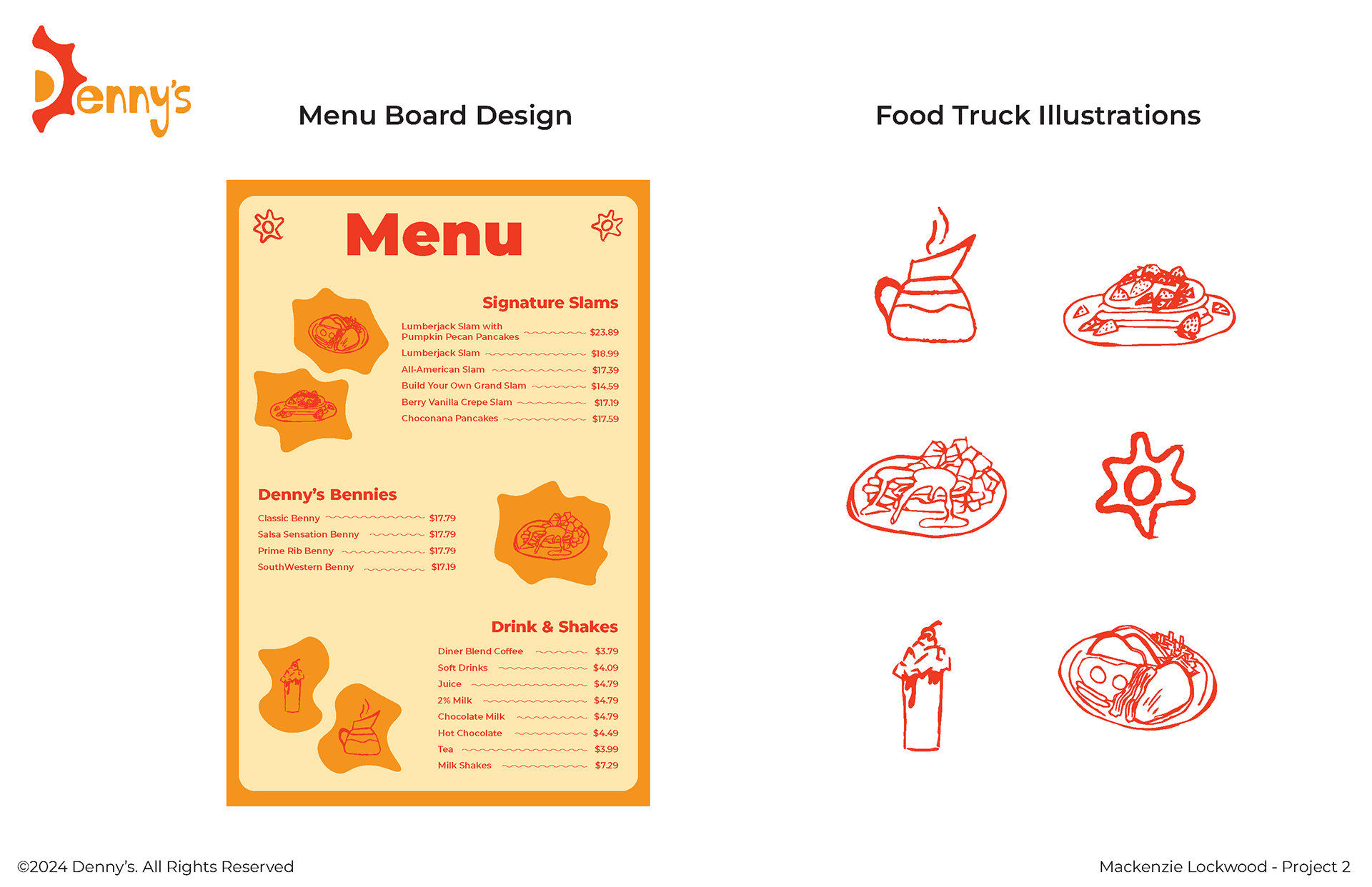
I began by redesigning the logo, turning the ‘D’ into a sunrise to represent breakfast time in the morning. I chose orange and red for the colours—red to grab attention and create a sense of urgency, and orange to evoke the warmth and happiness that breakfast brings, making the logo instantly recognizable and eye-catching.
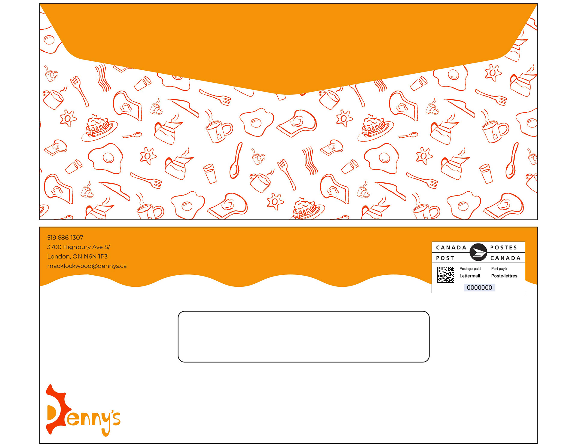
For the food truck design, I created a playful pattern that showcases a variety of Denny’s menu items. I kept the illustrations simple, capturing the lighthearted, family-friendly vibe that Denny’s is known for. The pattern not only highlights the food but also provides a great photo opportunity for millennials. Overall, my design is visually striking and aligns perfectly with Denny’s brand, conveying what the restaurant is all about.