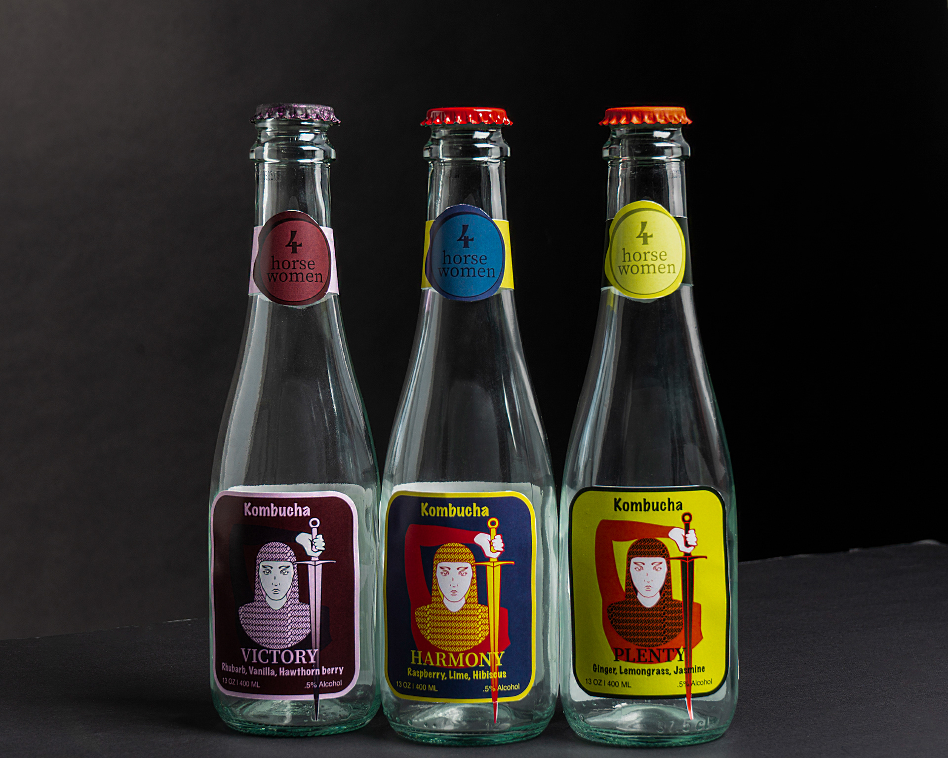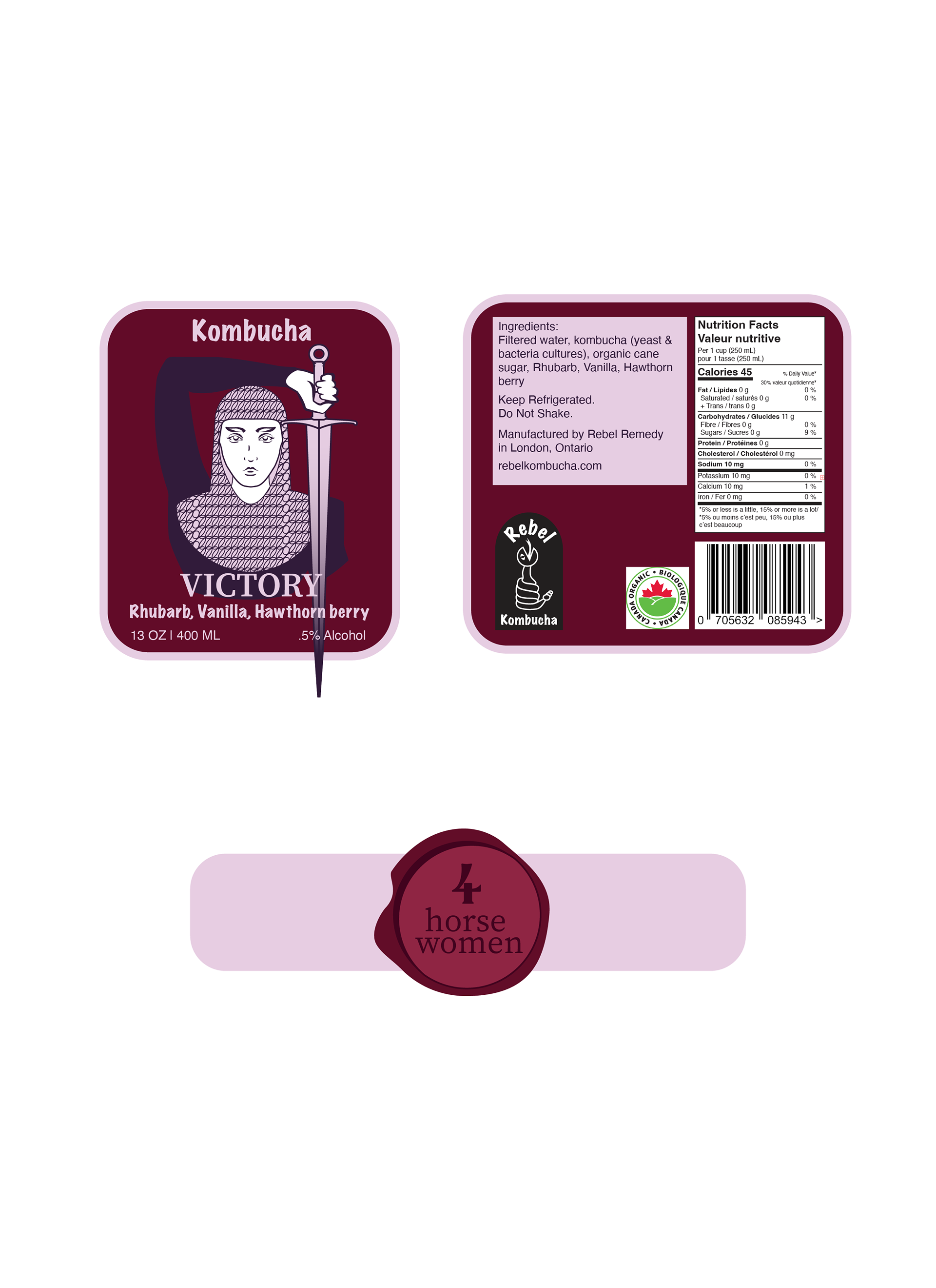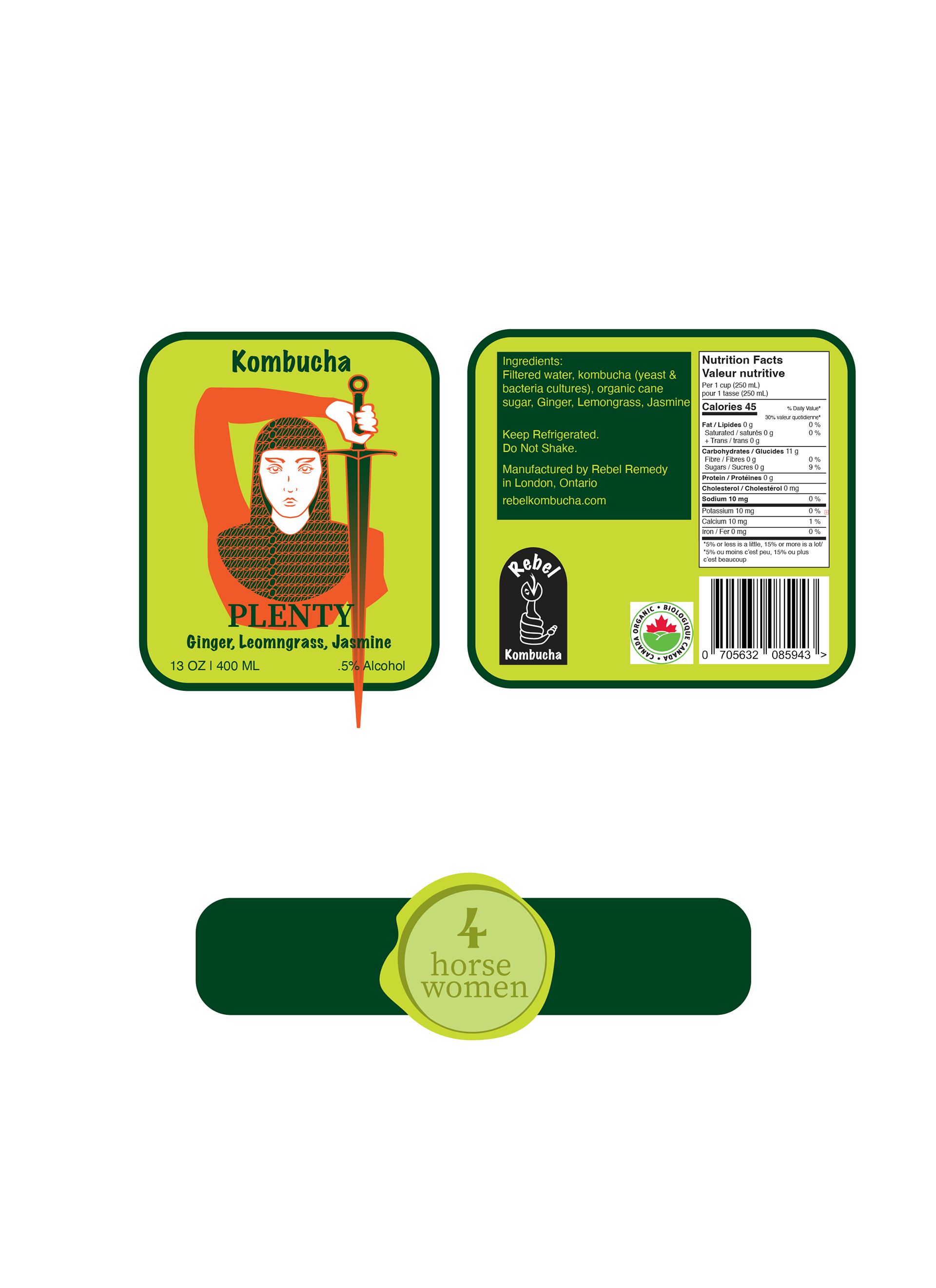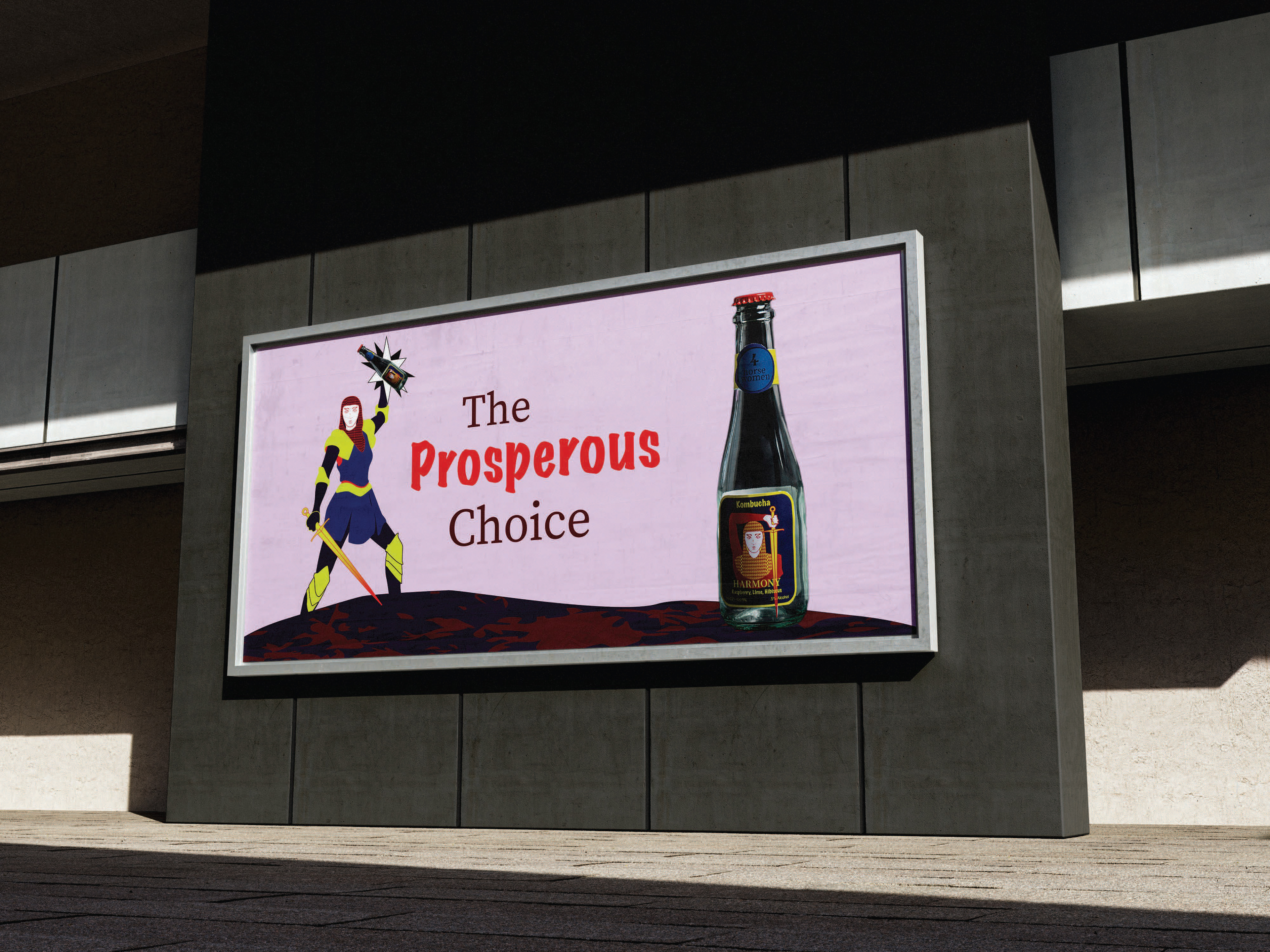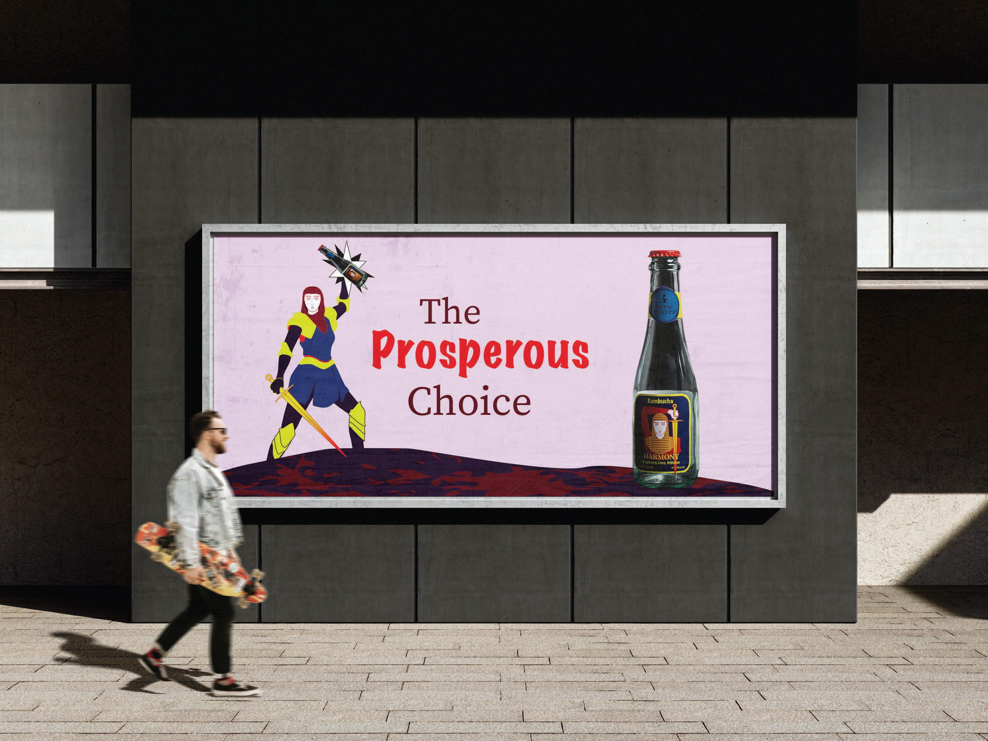
To begin, I thought about Rebel Kombucha’s brand message—being environmentally conscious and promoting recycling. My research delved into kombucha, the scoby, and clothing landfills, which evoked images of the apocalypse and the Four Horsemen of the Apocalypse. Rebel Kombucha actively combats environmental issues through recycling, so I flipped the concept and envisioned the opposite: the Four Horsewomen, symbolizing prosperity and positive change for the world.
I designed a warrior knight, each one representing a different kombucha flavour, with the sword pointing down to the drink name, guiding the viewer’s eye and creating a strong visual flow. Overall, the design is eye-catching and effectively communicates the brand’s message.